Design language Foundations
Logo and name
The Zerone logo is a glyph, the word zerone and two lockups that join them, horizontal and stacked. The lockups and the glyph come in ink on a light ground and in paper on an ink ground. This page shows every part, the geometry measured from the glyph’s own path, the names and tagline used with it, the files to download and the rules Zerone added where the designer left them open.
A glyph, a word, two lockups.
#The logo was delivered as six artboards: the horizontal and the stacked lockup, each on a light ground and reversed on ink, then the glyph alone on a 100 mm square of each ground. They are drawn here from the press files of this site, with its paper in place of white; the ink square is the ink tile.
One glyph, one path.
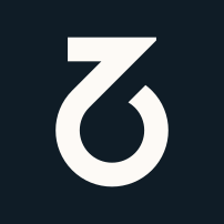
#The glyph is the part of the logo that also stands on its own: on the ink tile and, a size larger within the same square, in the favicon, on the company page panel and on the not-found page. In the navigation, the footer and the share cards it appears inside the horizontal lockup. On this site it is one SVG path, kept in one shared module and drawn in currentColor, so it takes the colour of the text around it. The path is the designer’s own, kept character for character.
Zero, one, Z and O
The glyph reads two ways. The ring is a zero and also the letter O; the stroke that rises out of the ring is a one; the top bar and that stroke together draw the letter Z. Zero and one are where everything digital starts, and Z and O are letters of the name.
Logo: VM Brand, 2024
| Item | Value |
|---|---|
| viewBox | 0 0 101.6 134.69 |
| Path | 311 characters, one subpath: 7 straight edges and 8 curves |
| Width to height | 0.754, from 101.6 by 134.69 |
| Fill | currentColor, the colour of the text around it |
| Without a title | aria-hidden="true", so it is decorative |
| With a title | role="img" with a title element inside |
Sizes in use
The components of this site size the glyph alone by width and the lockup by height; the other dimension follows from the proportions. These are the glyph widths in use today, at actual size. They are sizes in use, not a scale and not a minimum.
- 18.1 pxNavigation bar and footer
- 26 pxCompany page panel
- 48 pxNot-found page
| Place | Size in px | Ground |
|---|---|---|
| Navigation bar | 18.1 by 24 | Paper, in the horizontal lockup |
| Footer | 18.1 by 24 | Paper-2, in the horizontal lockup |
| Company page panel | 26 by 34.47 | Ink band, glyph in paper, next to the panel heading |
| Not-found page | 48 by 63.63 | Paper, above the heading |
| Share cards | 30.17 by 40, in a 199 by 40 lockup on a 1200 by 630 canvas | Paper, in the horizontal lockup |
| Favicon | Set by the browser | The square of the ink tile, with the glyph at two thirds of the side |
Take the glyph and the lockup from their shared modules. Never paste a path into a component.
WhyOne source for each keeps the navigation, the footer, the company panel, the not-found page and the share cards the same shape. A pasted copy drifts the first time someone edits it.
TestEnforced by a test on every change.
Where words nearby say the name, the glyph is decorative. Where it must carry the name on its own, it gets a title.
WhyA screen reader should hear the name once. In the navigation and the footer the lockup is hidden from assistive technology and the link carries the name as visually hidden text; the company panel has the name in its heading and the not-found page in the navigation above. None of them has a title; the only glyph with one is the specimen on this page.
TestEnforced by a test on every change.
Construction, measured from the path.
#No construction grid is documented for the glyph, in the code or in the logo files. What follows is measured from the coordinates of the path itself, so each number here changes when the path changes. Read them as measurements, not as a specification.
Measurements in path units
- Top bar
79.93by21.68Horizontal edges at y 0.00 and y 21.68; vertical edges at x 10.84 and x 90.77 - Diagonal
21.65acrossTwo parallel edges on x + y = 62.87 and x + y = 93.49; the long edge runs at 45.00 degrees - Ringouter r
50.81, inner r29.16, band21.65A circle fitted to the outer curves and one to the inner curves; centre (50.80, 83.91) - Opening
21.66wideThe ring ends in a cut on x + y = 124.12, parallel to the diagonal - EdgesTouches all four sidesThe furthest point of the path on each side lies less than 0.02 from the viewBox edge
One stroke weight.
The bar, the diagonal, the ring and the opening measure 21.68, 21.65, 21.65 and 21.66 units: they differ by less than 0.04. The glyph is 6.22 strokes high and 4.69 strokes wide. The centre of the bar, at x 50.81, and the vertical axis of the ring, at x 50.80, are less than 0.01 apart.
How the numbers are found.
The path is read command by command into straight edges and cubic curves. Horizontal and vertical edges give the bar. An edge at 45 degrees lies on a line where x + y is constant, so the distance between two parallel edges is the difference of their constants divided by the square root of two. The curves are sorted by radius into an outer and an inner set, and a circle is fitted to each set.
The wordmark is drawn, not typeset.
#In the logo files the word zerone is set in lowercase in New Black ExtraBold and converted to outlines, so the letters are shapes, not type. This site uses those outlines as they are: the navigation, the footer and the share cards draw the designer’s horizontal lockup, and nowhere does the site set the name as live text next to the glyph. ExtraBold is not loaded as a font; the site loads New Black only up to Bold.
| Property | Value |
|---|---|
| Where | Navigation bar and footer at 24 px high; share cards at 40 px high on the 1200 by 630 canvas |
| Height | 24 px, the height of the glyph |
| Width | 119.24 px, 4.97 times the height |
| Glyph box | 18.1 by 24 px |
| Lowercase letters | 16 px high, measured on the z |
| Gap | 9.65 px, 2.5 strokes |
| Typeface | New Black ExtraBold, outlined in the drawing; not loaded as a font |
| Accessible name | The link text zerone, visually hidden; the drawing is hidden from assistive technology |
Apart from web and e-mail addresses, the lowercase form appears on this site only in the lockup: in the navigation, in the footer and on share cards. Everywhere else the name is written Zerone, with a capital Z. The lockup is a drawing hidden from assistive technology, so the home link carries the name as visually hidden text and is announced by it alone.
Two lockups, horizontal and stacked.
#A lockup fixes the glyph and the word in one drawing, with their sizes and the space between them. In the horizontal lockup the glyph stands to the left of the word; in the stacked lockup it is centred above it. Both are the designer’s drawings and come as files in ink and in paper.
| Measure | Horizontal | Stacked |
|---|---|---|
| Glyph and word | Glyph to the left, as tall as the whole lockup | Glyph centred above the word |
| Glyph height | 1.5 times the lowercase letters | 1.73 times the lowercase letters |
| Space between | 2.5 strokes | 1.24 strokes |
| Width | 4.97 times the height | 1.84 times the height |
A stroke is the glyph’s stroke weight, measured under Construction, at the size the glyph has in that lockup. The lowercase letters are measured on the z, which has a flat top and a flat bottom.
In both files the glyph is the same drawing as the glyph alone, only scaled: measured in the path’s own units, the two differ by less than 0.02.
The navigation, the footer and the share cards draw the horizontal lockup from one shared module, which a test keeps equal to the press file. For its sizes in use, see The wordmark.
Ink on paper, paper on ink.
#The designer gives the logo two colourways: ink on a light ground, and the reverse on an ink ground. In the logo files the light ground and the reversed logo are white; this site uses no pure white, so here both are paper. On this site the glyph meets paper, paper-2 and, on the company page, an ink band.
--color-ink on --color-paper--color-ink on --color-paper-2--color-paper on --color-ink--color-paper on --color-inkThe ink
The designer defines one colour, the ink, for screen and for print. Its screen value is the site’s ink token, --color-ink.
| System | Value |
|---|---|
| Pantone | PANTONE Black 6 C |
| CMYK | 95 77 55 73 |
| RGB | 15 28 38 |
| HEX | #0f1c26, the value of --color-ink |
Paper and accent are the site’s own colours; the designer gives them no print values. Ours are under Added by Zerone.
The ink tile
The designer’s set ends with the glyph in paper on an ink square. On this site that square is the ink tile, a press file and the logo in the structured data: the designer’s artboard as drawn, with square corners and the glyph at its own size in the centre. Its values below are read from the file and compared with the artboard. The favicon keeps this square with a larger glyph; see Added by Zerone.
| Property | Value |
|---|---|
| Box | viewBox 0 0 283.465 283.465: a square of 283.46 units, the designer’s 100 mm artboard. The glyph keeps its own size; its height is 0.475 of the side |
| Corners | Square, no radius |
| Tile fill | #0f1c26, the value of --color-ink |
| Glyph fill | #fdfaf6, the value of --color-paper |
| Glyph position | translate(90.9325 74.3875): centred, 90.93 units left and right, 74.39 above and below; the designer’s artboard differs by less than 0.01 |
Zerone, Zerone Security, Zero Door
#Three names, each with its place. The company is Zerone in copy and Zerone Security in metadata. The product is Zero Door, always two words.
| Name | Use | Example on this site |
|---|---|---|
| Zerone | The company, in body copy and headings. | ‘Zerone is a product company.’, on the company page |
| Zerone Security | The company in metadata: og:site_name and the organisation name in the structured data of every page, and the suffix of most page titles. | ‘Company · Zerone Security’, the title of the company page |
| zerone | Only the wordmark in the lockup, in lowercase. | ‘zerone’, in the navigation and the footer |
| Zero Door | The product: two words, capital Z and capital D. A proper noun with no article, except where the name describes something else, as in ‘the Zero Door agent’. | ‘Discover Zero Door’, the main button on the home page |
| Zerone'un, Zero Door'u | In Turkish text a suffix follows an apostrophe and the name itself does not change. | On Turkish pages: ‘Zero Door'u keşfedin’ |
Written as one word, the name appears only inside machine names, such as web addresses and cookie names, and those are lowercase: the site path is /zero-door and the console runs on zerodoor.zeronesecurity.com. Two checks refuse the one-word form with a capital letter wherever it appears, and in lowercase unless it is part of a machine name such as a web address, a cookie name or a storage key:
| Check | What it reads |
|---|---|
| Dictionaries | Every English and Turkish dictionary, this page included |
| Built pages | Every built HTML file: visible text and text attributes such as alt, title, aria-label and meta content. Link and source addresses, scripts and styles are not read. In the key values of two test hooks, data-check and data-check-item, only the CamelCase spelling (capital Z, capital D, the rest lowercase) is refused. |
Zero Door is two words in every language, in visible text and in text attributes.
WhyA name spelt two ways reads as two products. The checks refuse the one-word form, so nobody has to remember it.
TestEnforced by a test on every change.
Zerone in copy, Zerone Security in metadata.
WhyCopy reads better with the short name. Search results and link previews show the name without the page around it, so they get the full one.
ReviewKept by review, not by a test.
Names are not translated.
WhyZerone and Zero Door are proper nouns. The Turkish pages use them as they are and add suffixes after an apostrophe.
ReviewKept by review, not by a test.
The tagline
#The tagline is written in title case with a comma, and it is not translated: Turkish pages use the English line. In use, it ends with a full stop where it stands as a sentence and has none where it works as a label.
- Home page, kick styleZero Trust, One Security
- FooterZero Trust, One Security.
- Company page panelZero Trust, One Security.
| Place | Form | Full stop |
|---|---|---|
| Home page, above the headline | Label, in the kick style | No |
| Footer, under the lockup | Sentence | Yes |
| Company page, in the panel | Sentence, under the panel heading | Yes |
| Home page share card | Kicker | No |
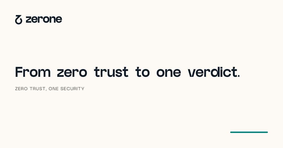
Zero and one recur in the copy: the home headline reads ‘From zero trust to one verdict.’ and the first of the four principles is ‘Nothing is trusted for having been there yesterday.’.
The tagline is not translated.
WhyIt is a fixed line, like a name. A Turkish version would make two taglines.
TestEnforced by a test on every change.
Use the logo as its files draw it.
#The press kit states the usage rules for the logo. This is its text, as published on the company page:
The Zerone logo is a glyph, the word zerone and two lockups that join them, horizontal and stacked. Use it in ink on light surfaces and in paper on ink. Do not recolour, rotate or add effects. The product name is written as two words: Zero Door.
Ink on a light ground, paper on an ink ground.
WhyThese are the designer’s two colourways. One colourway for each ground keeps the logo the same at every size, and it leaves the accent to its one job on this site: marking verified signal.
ReviewKept by review, not by a test.
The press files and the favicon carry the designer’s paths, in ink and paper.
WhyThese are the copies that leave the site. A test compares the glyph in each with the glyph module, the word with the designer’s outlines and every fill with the colour tokens, so a hand edit cannot drift unnoticed.
TestEnforced by a test on every change.
Do not stretch or squeeze the logo; scale it with its proportions.
WhyThe glyph and the lockups are measured drawings. A changed proportion changes the stroke and the spacing those measurements describe.
ReviewKept by review, not by a test.
Do not outline the logo or draw it as a stroke.
WhyThe designer drew filled shapes. An outline changes their weight, and at small sizes it breaks up.
ReviewKept by review, not by a test.
Do not crop the logo or let an edge cut through it.
WhyA cut glyph no longer reads as zero and one, and a cut lockup loses part of the name.
ReviewKept by review, not by a test.
Do not place the logo on a busy ground, such as a photograph or a pattern.
WhyThe two colourways assume a plain light or ink ground. On a busy ground the edges of the glyph are lost.
ReviewKept by review, not by a test.
Keep other elements outside the clear space.
WhyThe clear space, two strokes on every side, is the room the logo needs to be read as one shape.
ReviewKept by review, not by a test.
The press kit rules out recolouring, rotating and effects. The rules on stretching, outlines, cropping, busy grounds and clear space are Zerone’s own; their values and methods are under Added by Zerone.
Downloads
#Six SVG files, the same ones as in the press kit. The lockups are the designer’s drawings; the glyph files carry the path of the glyph module. Each has fixed fills, so it keeps its colours outside this site, and none has a width or height, so each scales to its container.
 Horizontal lockup (SVG, ink)For light grounds. The glyph stands to the left of the word.
 Horizontal lockup (SVG, paper)For an ink ground. The file has no ground of its own.
 Stacked lockup (SVG, ink)For light grounds. The glyph is centred above the word.
 Stacked lockup (SVG, paper)For an ink ground. The file has no ground of its own.
 Glyph (SVG, ink)For light grounds. The file has no ground of its own.
 Glyph on ink tile (SVG)The designer’s ink square, with its own ground. This file is also the logo in the structured data of every page; the favicon is the same square with a larger glyph.
The press kit on the company page has the same six files and the three brand colours with their print values.
The fills are the values of the ink and paper colour tokens. The token file of this site is available to download as tokens.css.
Share cards
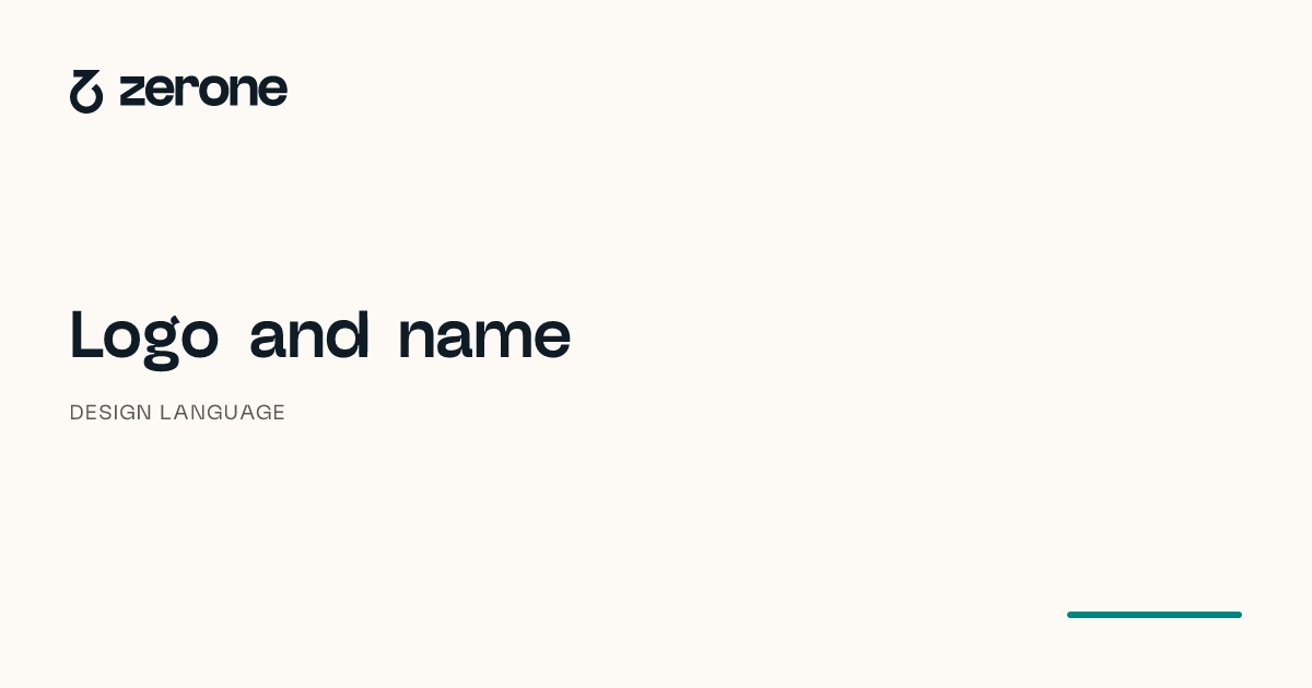
#Share cards are rendered at build time: 1200 by 630 pixels on paper, with the horizontal lockup, a title, a kicker and a short accent rule. Pages without a card of their own, such as the legal texts, use the home card. No card is drawn by hand.
| Part | Value |
|---|---|
| Canvas | 1200 by 630 px, PNG, rendered with the site build |
| Ground | #fdfaf6, the value of --color-paper |
| Padding | 64 px on every side |
| Lockup | The horizontal lockup in a 199 by 40 box, in ink, from the shared lockup module: the glyph 30.17 by 40, the lowercase letters 26.66 px high, 16.09 px apart |
| Title | The page heading at 64 px, weight 700, line height 1.08, tracking -0.02em; cut after 70 characters |
| Kicker | 20 px, weight 400, tracking 0.08em, uppercase, in #5c5753, the value of --color-ink-muted |
| Title to kicker | 22 px |
| Accent rule | 160 by 6 px, radius 3, in #00847e, the value of --color-accent, at the bottom right |
| Typefaces | New Black 400 and 700 only; system fonts are switched off |
Card colours are the colour tokens of the site.
WhyThe renderer runs in Node and cannot read CSS custom properties, so it repeats the hex values. A test keeps them equal to the colour tokens.
TestEnforced by a test on every change.
Every page links an absolute share image that exists.
WhyA missing or relative image shows an empty box in link previews. The gate opens every built page and checks the file.
TestEnforced by a test on every change.
Added by Zerone.
#The logo files leave clear space, minimum sizes and print values for paper and accent open. The rules below are ours, set in 2026, not the designer’s; each one is measured from the files or stated with its method.
| Topic | Our rule | How it is held |
|---|---|---|
| Clear space | Two strokes on every side of the glyph and of each lockup | Test: the value is computed from the stroke of the glyph |
| Minimum size | Glyph 16 px, horizontal lockup 24 px, stacked lockup 50 px high on screen; 5, 7 and 14 mm in print | Test: the sizes are computed from the files and the navigation |
| Paper in print | Not printed: the stock is the paper colour | Review: a choice of stock, not a value |
| Accent in print | CMYK 84 17 44 13, converted from the screen value | Test: the value is pinned; the conversion is repeated wherever the profile is installed |
| Favicon | The square and centring of the ink tile, the glyph enlarged to two thirds of the side | Test: the file is measured: square, centred, glyph at two thirds |
| Misuse | No stretching, outlines, cropping or busy grounds | Review: no test can judge a layout |
Clear space
Keep two strokes free on every side, measured from the bounds of the drawing: 43.32 units in the glyph file, 0.32 times the glyph height. In a lockup the stroke is measured at the size the glyph has there, so the clear space scales with the lockup. The files themselves are cut to the drawing and carry no margin.
Minimum size
These minimum sizes are ours, chosen from the smallest uses on this site; the designer set none. On screen they are CSS pixels. In print they are the same sizes at the CSS reference of 96 px to the inch, rounded up to the whole millimetre.
| Form | On screen | In print | Set from |
|---|---|---|---|
| Glyph alone | 16 px high | 5 mm high | The smallest favicon a browser draws |
| Horizontal lockup | 24 px high | 7 mm high | The navigation bar, its smallest use on this site |
| Stacked lockup | 50 px high | 14 mm high | Its lowercase letters as tall as those of the horizontal lockup at its minimum, 16 px, rounded up |
| Favicon | 16 px wide | 5 mm wide | The smallest size a browser draws it; the glyph in it is then 10.67 px high |
The favicon
At 16 px, the browser’s tab size, the designer’s square leaves the glyph 7.6 px high, too small to read. The favicon keeps the square, the square corners and the centring of the ink tile but enlarges the glyph to two thirds of the side, so it is 10.67 px high at the same size. This is Zerone’s rule, not the designer’s; the ink tile in the press kit and in the structured data stays the designer’s square.
Print values for paper and accent
The designer gives print values for the ink only. For paper and accent these are ours. Paper is not printed: on paper its colour is the stock itself, so choose an uncoated natural white close to #fdfaf6 and do not print a tint. The accent is converted from its screen value, #00847e, through the macOS Generic CMYK Profile with relative colorimetric intent, which gives CMYK 84 17 44 13. It is a derived value, not the designer’s specification: confirm it on a proof before a print run.
| Colour | Screen | Set by | |
|---|---|---|---|
| Ink | #0f1c26 | PANTONE Black 6 C, CMYK 95 77 55 73 | The designer |
| Paper | #fdfaf6 | Not printed; the stock | Zerone |
| Accent | #00847e | CMYK 84 17 44 13, derived | Zerone |